I hadn't even realised there was a "night" setting. Now, having tried it, I prefer the "day" setting, it seems more natural to read black text on a white ground like the vast majority of newspapers books and magazines. White on black(or any other colour) seems a bit gimmicky.
I used to use vt100 terminals (if you know what that is, you know how that dates me) in inverse video mode, which somewhat resembles the Day mode here. But I find I like the Night mode better, because it reminds me of what the web was like back in the 1990s.
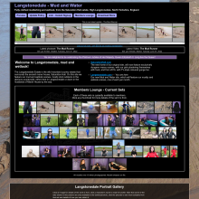
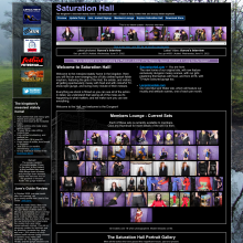
I prefer "Night" mode, probably because I remember the original UMD which was a dark purple colour, and for some reason I think black text on a white background doesn't really suit a website dedicated to a sexual fetish, but as other people have different views it's nice that you are democratic enough to offer the choice to individuals.
I dislike white-background websites, Facebook has a lot to answer for. On paper, yes, black on white is easier to read, but on a screen glowing text on a dark background is easier to read and as Leila said less likely to cause a headache.
Plus the Internet is meant to be the future - for those of us old enough to remember the time before, glowing lines on dark screens was where the future was at.
Well thanks for voting everyone. I had no clue what the results would be, but I think it's interesting that most chose the night mode. It's the original color scheme of the site. When I changed it to white years ago, when all the rage was making things look "not adult," people rebelled, so then I put the dark mode back in as an option!
fruju_nz2003 said: Just to confuse matters, I use the Night setting when I'm visiting the site at during the evening and the Day setting...well, you get the idea.
I also didn't mention that there's an automatic mode that switches based on the time! Though it's currently hardwired to the EST time zone
Thanks again guys
Stay messy, my friends
7/7/24, 5:11pm: This post won't bump the thread to the top.


 Love you, too


 )
)