We've been wanting to do this forever but finally found the time - both of our main websites have been fully upgraded to modern standards, accessibility, and full compatibity with both computer and mobile browsers.
We've also stripped out a lot of clutter and obsolete design, moving both the current sets thumbnail galleries, and the character-focused portrait galleries, front and centre of the new layout, so visitors can quickly find what they want to see. The portrait galleries haven't been updated for a long time however we're planning to tackle that shortly, with new scripting and automation to make adding people and scenes much simpler.
There's a lot of behind the scenes work still to be done, but we wanted to launch the new public facing front pages and features first. Some of the new features are:
Pop-Up Images: One of the biggest improvements in usability is that when you click on an image in either preview or inside the Members Lounge, they now open on the screen you are on as a popup which can be dismissed by just clicking the image, or anywhere on the page, making it much easier to open and close images withot having to constantly click the browser's "Back" button.
Hamburgers for all! There's now a "hamburger menu" for the more minor links on mobile, while keeping the all-important Join and Members Lounge items as separate buttons top right.
Standardisation of Layout: Most sites nowadays which have login have it top-right of the screen, whereas our "Members Lounge" link was in the middle of the menu set. It's now top right and much more prominent, and says "Members Log In" for clarity.
Clearer Navigation: A few folk had told us they'd not realised we had two separate sites, so links between them are now placed right after the site header on wide screens, and on an "Our Sites" item in the hamburger menu for mobiles.
Other than the new pop-up image click, the Members Lounge area is unchanged, it's a bit clunky looking but works and users have told us it makes it easy to find and download the content, and we are firm believers in not messing with stuff that works. We are planning to look at improving it a bit, in particular the way scenes other than the three most recent ones feature at the top, tend to appear in a random order, and perhaps making the layout a bit less boxy (we are after all a stately home of grace and beauty, not an industrial steelworks), but the core functionality of making it as easy as possible to locate and download videos and photo zip files for each set in a clear, easy to read format, will remain - function first, last, and always.
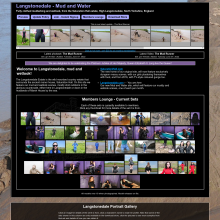
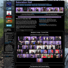
Screencaps below show: 1. Saturation Hall main index page, Current Sets then Portrait Gallery. 2. A Saturation Hall detail page, accessible from the Preview area. 3. Same as 2 with one of the images popped-up. 4. Langstonedale main index page with the mouse over the link back to Saturation Hall. There's a similar link on Saturation Hall to Langstonedale.
We hope people find the new layouts quick and easy to use. Enjoy!
Links: saturationhall.com: Saturation Hall - fully clothed messy dungeon fun. langstonedale.com: Outdoor mudbaths and indoor and outdoor wetlook.


 Love you, too
 Pop-Up Images: One of the biggest improvements in usability is that when you click on an image in either preview or inside the Members Lounge, they now open on the screen you are on as a popup which can be dismissed by just clicking the image, or anywhere on the page, making it much easier to open and close images withot having to constantly click the browser's "Back" button.
 There's now a "hamburger menu" for the more minor links on mobile, while keeping the all-important Join and Members Lounge items as separate buttons top right.